How to create charts that adhere to the publication requirements using Matplotlib.

How to create charts that adhere to the publication requirements using Matplotlib.

   从Nature到普通SCI:如何使用matplotlib绘制符合期刊要求的图表 

Solarize_Light2:

_classic_test_patch:

_mpl-gallery:

mpl-gallery-nogrid:

bmh

classic

dark_background

fast

fivethirtyeight

ggplot

seaborn

seaborn-bright

seaborn-colorblind

seaborn-dark

seaborn-paper

seaborn-pastel

seaborn-poster

seaborn-talk

seaborn-tick

seaborn-white

seaborn-whitegrid

tableau-colorblind10:

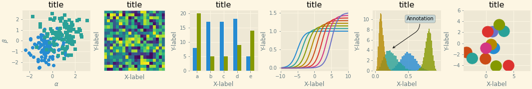
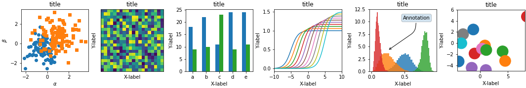
  1. Solarize_Light2: This style is designed to be visually pleasing and easy on the eyes. It uses light colors and high contrast, making it suitable for presentations and documents.

  2. _classic_test_patch: This style is an internal test style for Matplotlib. It is not intended for regular use.

  3. _mpl-gallery: This is a style used for displaying plots in the Matplotlib gallery. It focuses on clarity and simplicity.

  4. _mpl-gallery-nogrid: Similar to the ‘_mpl-gallery’ style but with no grid lines in the background.

  5. bmh: This style is inspired by the aesthetics of the Bayesian Methods for Hackers (BMH) website. It has a clean and modern appearance.

  6. classic: The ‘classic’ style provides a traditional, simple, and familiar look for your plots with black lines on a white background.

  7. dark_background: This style inverts the typical color scheme, using a dark background with light-colored lines and text. It’s useful for presentations and when you want to reduce eye strain in low-light conditions.

  8. fast: The ‘fast’ style is designed to be minimal and quick to render. It is suitable for large datasets and quick exploratory data analysis.

  9. fivethirtyeight: This style emulates the visual style of plots seen on the FiveThirtyEight website, known for its data-driven journalism.

  10. ggplot: This style is inspired by the aesthetics of the ggplot2 package in R. It provides a clean and modern look for your plots.

  11. grayscale: As the name suggests, this style renders plots in grayscale, which can be useful for printing or situations where color is not available.

  12. seaborn: This style mimics the aesthetics of the Seaborn data visualization library, offering visually appealing and informative plots with subtle colors.

  13. seaborn-bright: A variation of the Seaborn style with brighter colors.

  14. seaborn-colorblind: Designed to be colorblind-friendly, this style uses distinct and easily distinguishable colors.

  15. seaborn-dark: A dark-themed variation of the Seaborn style.

  16. seaborn-paper: This style optimizes plots for printing in scientific papers, with clear lines and a light color palette.

  17. seaborn-pastel: A pastel-colored variation of the Seaborn style.

  18. seaborn-poster: This style is suitable for poster presentations, with larger fonts and clear, high-contrast elements.

  19. seaborn-talk: Designed for talks and presentations, this style emphasizes clarity and readability.

  20. seaborn-ticks: A variation of the Seaborn style with customized tick styles.

  21. seaborn-white: A white-themed variation of the Seaborn style.

  22. seaborn-whitegrid: A variation of the Seaborn style with grid lines on a white background.

  23. tableau-colorblind10: This style is designed to be colorblind-friendly and uses a distinct palette of 10 colors.

1
2
3
4
5
6
7
8
9
10
11
12
13
14
15
16
17
18
19
20
21
22
23
24
25
26
27
28
29
30
31
32
33
34
35
36
37
38
39
40
41
42
43
44
45
46
47
48
49
50
51
52
53
54
55
56
57
58
59
60
61
62
63
64
65
66
67
68
69
70
71
72
73
74
75
76
77
78
79
80
81
82
83
84
85
86
87
88
89
90
91
92
93
94
95
96
97
98
99
100
101
102
103
104
105
106
107
108
109
110
111
112
113
114
115
116
117
118
119
120
121
122
123
124
125
126
127
128
129
130
131
132
# the matplotlib version used here is matplotlib 3.5.2

import numpy as np
import matplotlib.pyplot as plt

# plt.style.use('default') # 默认布局,下方和左侧有刻度线(朝外)
# plt.style.use('classic') # 经典布局,四周都显示刻度线(朝内)
# plt.style.use('Solarize_Light2') # 淡黄色背景,白色实线方格
# plt.style.use('bmh') # 下方和左侧有刻度线,刻度线朝内,方格面板,格线是虚线
# plt.style.use('dark_background') # 黑色背景,下方和左侧有刻度线(朝外)
# plt.style.use('fivethirtyeight') # 无坐标轴线,无刻度,方格面板,绘图线条较粗
# plt.style.use('ggplot') # 灰色方格面板,格线是白色实线
# plt.style.use('grayscale') # 黑白图
# plt.style.use('seaborn') # 无刻度线,白色实线方格面板(面板是浅色)
# plt.style.use('seaborn-ticks') # 刻度线稍长

print(plt.style.available) # 输出可用的风格

# ['Solarize_Light2', '_classic_test_patch', '_mpl-gallery',
# '_mpl-gallery-nogrid', 'bmh', 'classic', 'dark_background', 'fast',
# 'fivethirtyeight', 'ggplot', 'grayscale', 'seaborn', 'seaborn-bright',
# 'seaborn-colorblind', 'seaborn-dark', 'seaborn-dark-palette', 'seaborn-darkgrid',
# 'seaborn-deep', 'seaborn-muted', 'seaborn-notebook', 'seaborn-paper', 'seaborn-pastel',
# 'seaborn-poster', 'seaborn-talk', 'seaborn-ticks', 'seaborn-white', 'seaborn-whitegrid',
# 'tableau-colorblind10']

def plot_scatter(ax, nb_samples = 100):
"""Scatter plot."""
for mu, sigma, marker in [(-.5, 0.75, 'o'), (0.75, 1., 's')]:
x, y = np.random.normal(loc=mu, scale=sigma, size=(2, nb_samples))
ax.plot(x, y, ls='none', marker=marker)
ax.set_xlabel('$\\alpha$')
ax.set_ylabel('$\\beta$')
ax.set_title('title')


def plot_heatmap(ax, size=(20, 20)):
"""Plot an image with random values and superimpose a circular patch."""
values = np.random.random_sample(size=size)
ax.imshow(values, interpolation='none')
ax.set_xticks([])
ax.set_yticks([])
ax.set_xlabel('X-label')
ax.set_ylabel('Y-label')
ax.set_title('title')


def plot_bar_graphs(ax, min_value=5, max_value=25, nb_samples=5):
x = np.arange(nb_samples)
ya, yb = np.random.randint(min_value, max_value, size=(2, nb_samples))
width = 0.3
ax.bar(x, ya, width)
ax.bar(x + width, yb, width, color='C2')
ax.set_xticks(x + width/2, labels=['a', 'b', 'c', 'd', 'e'])
ax.set_xlabel('X-label')
ax.set_ylabel('Y-label')
ax.set_title('title')


def plot_colored_lines(ax):
"""Plot lines with colors following the style color cycle."""
t = np.linspace(-10, 10, 100)
def sigmoid(t, t0):
return 1 / (1 + np.exp(-(t - t0)))

nb_colors = len(plt.rcParams['axes.prop_cycle'])
shifts = np.linspace(-5, 5, nb_colors)
amplitudes = np.linspace(1, 1.5, nb_colors)
for t0, a in zip(shifts, amplitudes):
ax.plot(t, a * sigmoid(t, t0), '-')
ax.set_xlim(-10, 10)
ax.set_xlabel('X-label')
ax.set_ylabel('Y-label')
ax.set_title('title')


def plot_histograms(ax, nb_samples=10000):
params = ((10, 10), (4, 12), (50, 12), (6, 55))
for a, b in params:
values = np.random.beta(a, b, size=nb_samples)
ax.hist(values, histtype="stepfilled", bins=30,
alpha=0.8, density=True)

ax.annotate('Annotation', xy=(0.25, 4.25),
xytext=(0.9, 0.9), textcoords=ax.transAxes,
va="top", ha="right",
bbox=dict(boxstyle="round", alpha=0.2),
arrowprops=dict(
arrowstyle="->",
connectionstyle="angle,angleA=-95,angleB=35,rad=10"),
)
ax.set_xlabel('X-label')
ax.set_ylabel('Y-label')
ax.set_title('title')


def plot_colored_circles(ax, nb_samples=15):
for sty_dict, j in zip(plt.rcParams['axes.prop_cycle'](),
range(nb_samples)):
ax.add_patch(plt.Circle(np.random.normal(scale=3, size=2),
radius=1.0, color=sty_dict['color']))

ax.set_xlim([-4, 8])
ax.set_ylim([-5, 6])
ax.set_aspect('equal', adjustable='box') # to plot circles as circles
ax.set_xlabel('X-label')
ax.set_ylabel('Y-label')
ax.set_title('title')


def plot_figure(style_label):
fig, axs = plt.subplots(ncols=6, nrows=1, num=style_label, figsize=(14.8, 2.5), layout='constrained')
plot_scatter(axs[0])
plot_heatmap(axs[1])
plot_bar_graphs(axs[2])
plot_colored_lines(axs[3])
plot_histograms(axs[4])
plot_colored_circles(axs[5])


if __name__ == "__main__":
# plot_styles = ["default", "classic", "Solarize_Light2", "bmh", "dark_background", "fivethirtyeight", "ggplot",
# "grayscale", "seaborn", "seaborn-ticks", "nature", "science", "latex-sans"]
plot_styles = ['Solarize_Light2', '_classic_test_patch', '_mpl-gallery', '_mpl-gallery-nogrid', 'bmh', 'classic', 'dark_background', 'fast', 'fivethirtyeight', 'ggplot', 'grayscale', 'seaborn', 'seaborn-bright', 'seaborn-colorblind', 'seaborn-dark', 'seaborn-dark-palette', 'seaborn-darkgrid', 'seaborn-deep', 'seaborn-muted', 'seaborn-notebook', 'seaborn-paper', 'seaborn-pastel', 'seaborn-poster', 'seaborn-talk', 'seaborn-ticks', 'seaborn-white', 'seaborn-whitegrid', 'tableau-colorblind10']

for style_label in plot_styles:
with plt.style.context(style_label):
plot_figure(style_label)

# plt.savefig(style_label + ".pdf")
plt.show()

How to create charts that adhere to the publication requirements using Matplotlib.

https://songchen.science/blog/posts/92351494/

Author

Song Chen

Posted on

2023-10-16

Updated on

2023-10-26

Licensed under

Comments